Contextualizing the Artistic Process
Written by: gibru
Published on December 3, 2023
Preparations
These opening words are meant to invite you to take a conceptual look at my image creation process. That process is rather multifaceted. Here, I want to highlight one particular workflow. The aim is to visually and linguistically contextualize the steps in order to lay the foundation for further discussion.
To make things a little easier, I have illustrated my workflow below. First, however, I should probably make mention of the tools used for the illustrations in this piece:
- A drawing tablet
- Krita (opens in a new tab)
- InvokeAI (opens in a new tab)
And for the final images I made some minor adjustments to better suit my chosen workflow:
- A drawing tablet
- Krita + the AI Diffusion (opens in a new tab) plugin
Typically, I use and keep learning different tools depending on what I want to achieve. The strategy is to approach the software selection with an open mind as it gives me the necessary flexibility to optimize the way I work. If need be. Obviously. Just one requirement: it has to be open source. For some, a conceptual feature. For others, a practical one. And more than just good enough as with the selection mentioned above you’ll have enough to open up your own (digital) art studio.
Second, I want to provide you with a metaphor to help you verbalize the process. Hopefully with some clarity. To that end, I suggest to look at what’s about to follow through the lens of the art of cooking. More specifically, in the illustrations below you’ll encounter four terms that all fall under the umbrella of generative A.I.. Here’s how we are going to map them to the art of cooking:
| Model | ⟶ | Professional Chef |
| Refiner | ⟶ | Sous-Chef |
| Prompt | ⟶ | Recipe |
| Denoising | ⟶ | Level of Creativity |
| Drawing & Variants | ⟶ | Dish |
Which leads us to the process in a nutshell: as an amateur chef, I have prepared a dish (my original drawing). Next, I will give that dish to the professional chef — including my recipe for the dish (prompt). Then, I specify the level of creativity (denoising). In other words, I let the chef know how much his dish has to resemble the source dish (starting with my original one). And to adhere to my recipe. Finally, I guide the process with occasional tweaks here and there.
Based on that approach, I told the chef to prepare multiple dishes for each iteration. My mission was simply to choose the one I was most satisfied with. That dish then ended up being selected as a variant. Finally, the variant itself was used as the new base for the next one. And the next one for the one after that. And so on.
So, without further ado, let’s dig in.
The Island Project
Illustrating with words.
Description
A set of images called: The Island Project (CC0 1.0)
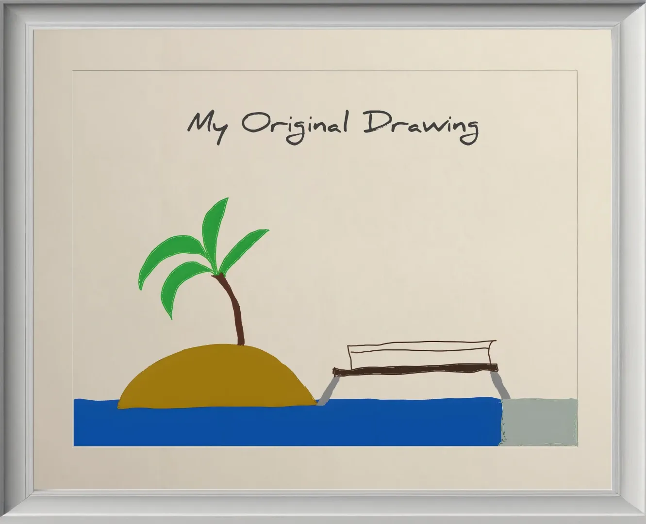
The starting point is my original “masterpiece” — or my own contribution as a source of inspiration for the chef to spin off his first dish (variant). After that, there’s a set of eight variants. I added a few words for each one to provide additional context.
Original
Humble beginnings
description
Quickly doodled on a drawing tablet by yours truly.
This particular oeuvre is something I’m pretty sure you can draw as well. All it takes is a hand that can hold a pen. Congratulations! You’re on your way to becoming the next Picasso. Well, my style — if I keep practicing by hand for a few more decades — will rather lead me in the direction of Henri Rousseau (opens in a new tab). Nothing to complain about, though.
First Variant
Introducing the professional chef
description
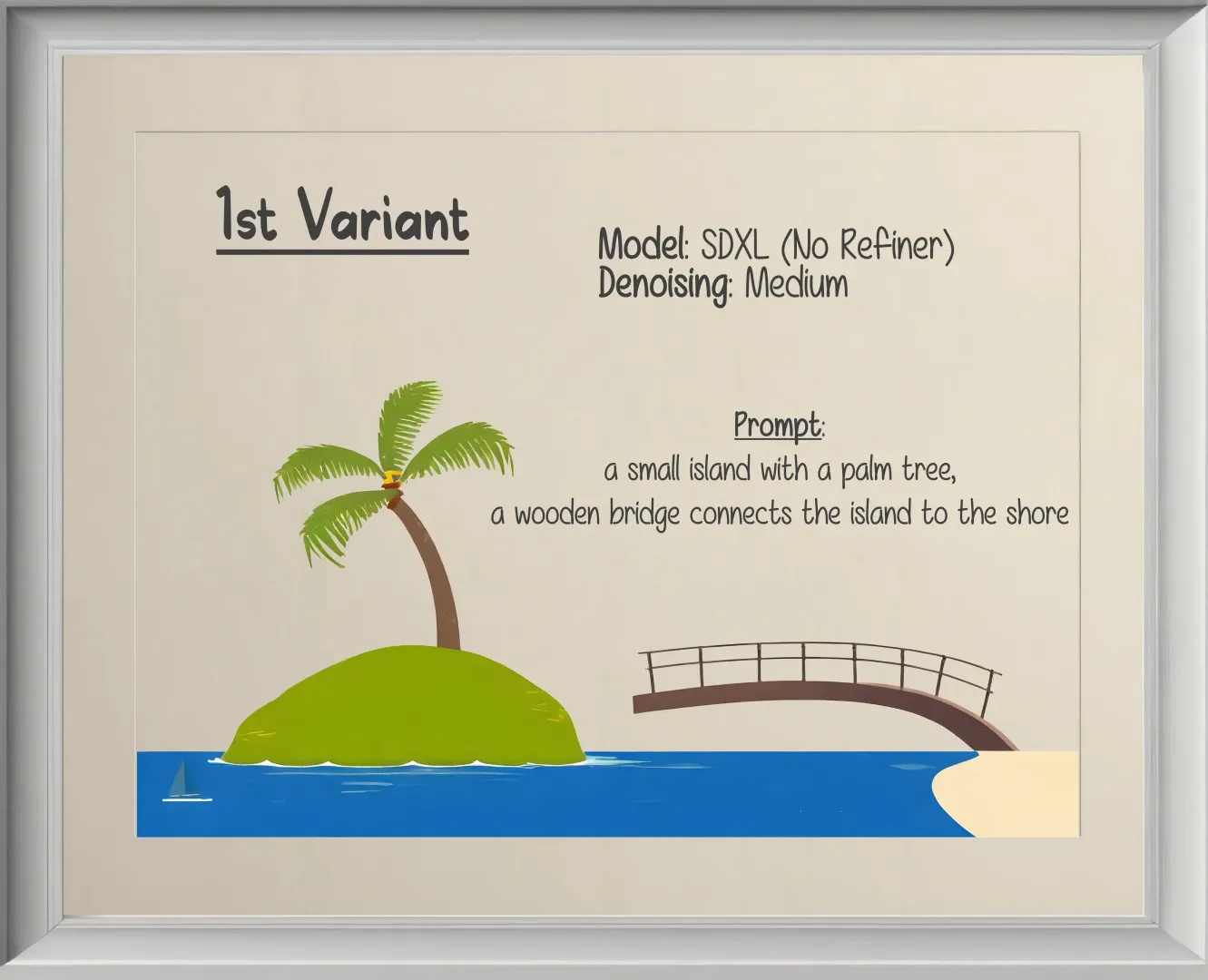
Still far from impressive.
Beginning with the first variant, only the chef was involved. No sous-chef. With a medium denoising level, I asked that my original drawing be modified enough to allow for room for improvement. But not too much to create something completely different. The recipe is kept simple. It states the obvious. Even though my way of drawing the shore was quite unimaginative. Perhaps even somewhat confusing. Doesn’t matter. The chef figured it out. And he did a bang-up job as far as I’m concerned. I really like how the bridge connects to the shore. Never mind that it doesn’t connect to the island. That’s a minor detail not worthy of the term obstacle. In any case, I saw a lot of potential for this variant to be an ideal candidate as the source for the next iteration. I even felt comfortable enough to give the chef a lot more creative freedom for his next dish. As a result, the jump from the first to the second variant is massive.
Second Variant
Connecting the bridge
description
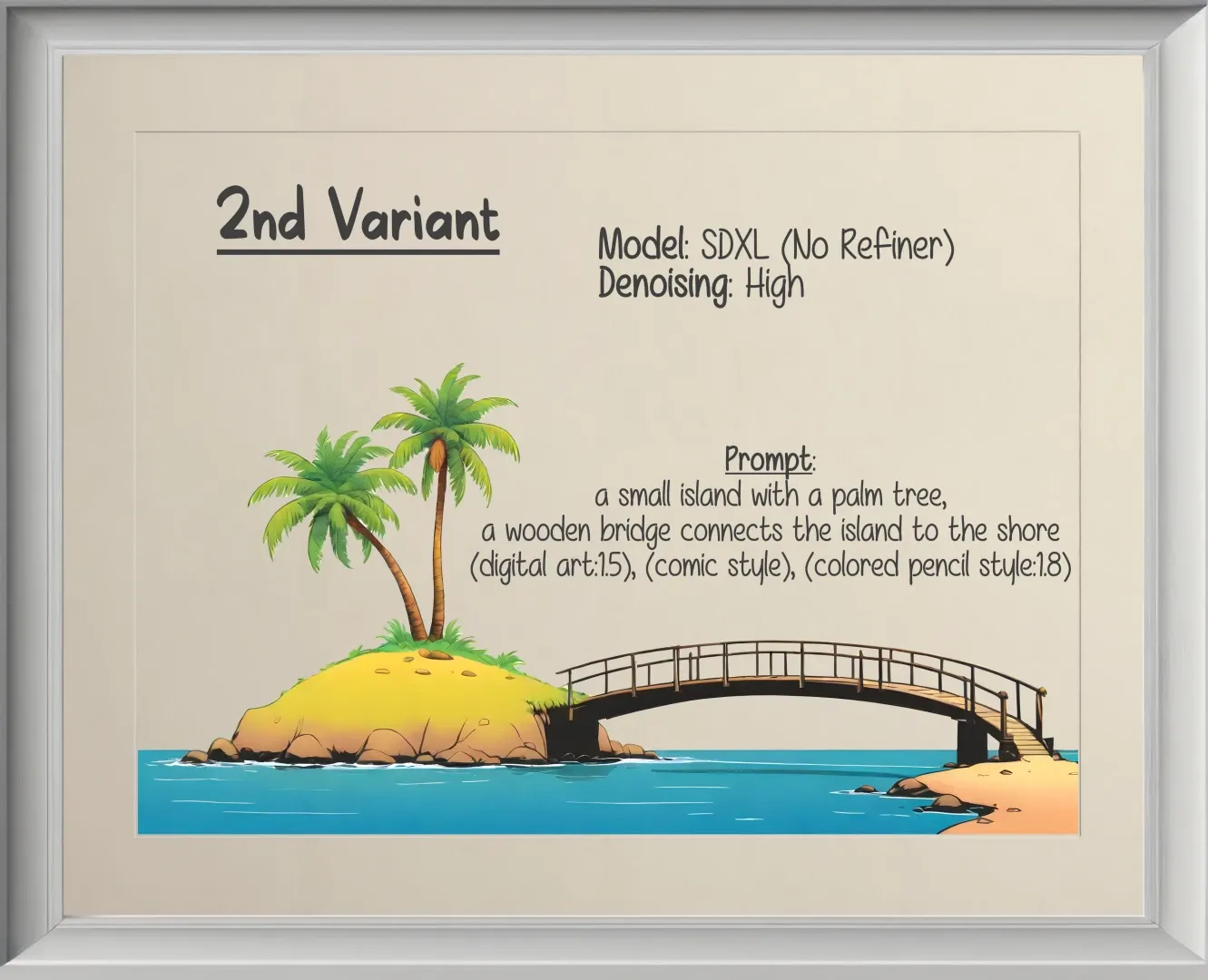
Adding a few digits to the linguistic mix.
I trust myself to be able to draw on the level of the first variant within a day or two. The second one on the other hand? Let’s just say the chef and the sous-chef are now on their own. Besides resorting to strategies like inpainting and outpainting (which we’ll take a look at in a moment), my main task now primarily resides in verbally expressing my vision. Luckily, that’s where I’m a professional chef myself. So we are going to get along pretty well. A linguistic chef. And a bunch of artistic chefs.
At any rate, that second variant is where the future of a successful transition from my vision to its realization is set in stone. From here on, I can take that illustration wherever I want. The limits are imposed by my own imagination and by how much wiggle room I’m willing to give to my artistic chef. This has to do with context. More specifically, context can be divided into two parts: visual and linguistic. The more nuance we give to either one of them, the less is needed in the other one. Put simply, with an original drawing already on an expert level artistically, creating variations will be less demanding linguistically. By contrast, starting with a basic draft, it will be more demanding to verbalize the vision. Or we’ll require more iterations before we reach the above threshold between amateur and professional. However, once that threshold is passed, it’s pretty much smooth sailing if you know how to express the nuances of your vision. There won’t be much of a difference anymore between amateur and professional. Other than theory, maybe. Is the lighting natural? Is this and that physically possible? What about the shadows? Of course, the amount of nuance that has to be right depends on what we intend to do with the output. Stylistically, however, it is going to be whatever we want it to be. There are no limits.
With that in mind, looking at the prompt (or my recipe) for the second variant, it appears to be a bit more nuanced. Because I gave the chef so much creative freedom (high denoising) compared to the transition between my original drawing and the first variant I also had to give him further directions. This leads us to the choice of artistic styles and how much he should weigh them. Within our metaphor, you can think of this as the seasoning part: we are telling the chef what to use and how much of it. This can create all kinds of different blends. Again, the sky’s the limit. Of note: in spite of a stronger weight i.e 1.8 put on colored pencil style, it doesn’t actually stand out. This is something I’m still experimenting with. Say, pairing it with something like digital art might simply weaken the colored pencil. In isolation and depending on the starting point, however, it can work really well. On top of that, collaborating with the sous-chef (Refiner) to refine our chef’s dish further is also a possibility. But for the purpose of this piece, it will do. Besides, I never publish in a rush so my decisions are quite deliberate.
Now, one question that’d be on my mind if I were you is the one about the palm tree. While the recipe still specifies one tree, the second variant suddenly has two. Here’s the reason: I gave the chef enough freedom to come up with new suggestions on his own. And he did. Sounds a bit like a human chef, doesn’t it? Well, you might want to draw a philosophical line here. But back to the matter at hand. For this variant, he decided to add another palm tree in the process. Why not? I was cool with that. But what if I weren’t? What if I wanted him to create the same (or similar) dish with one palm tree as stated in the recipe? At present, at least two options: the quick one would be to keep the denoising high in conjunction with ControlNet (opens in a new tab) or the T2I-Adapter (opens in a new tab). This is something I am not going to discuss here. The second and more time-consuming approach is to keep the denoising lower and to iterate more often. Though, with the release of SDXL-Turbo (opens in a new tab) during the writing of this piece, I’m not even sure anymore what time-consuming is supposed to mean. By the way, when it comes to tech matters, that’s in part the reason for why I want to keep my writing more conceptual. Otherwise, I’d have to keep updating my publications almost on a daily basis at this point.
Third Variant
Subtle styling
description
Baby steps...
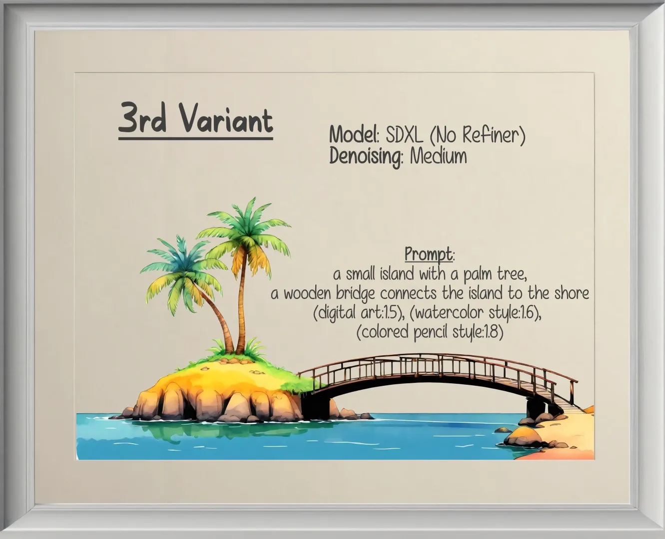
Moving on to the third variant. Here, I simply wanted to play with styles. In order to do so, I slightly changed the recipe by replacing comic style with watercolor style. Furthermore, I gave it some more weight. Pop quiz: would you say that the result looks like a watercolor painting? Personally, I’d argue not really. The changes are very subtle. Allowing me to get a feel for the direction we’re headed in. And technically, there are a couple of reasons for this rather nuanced progression: first, with a medium level of creativity, the chef is allowed to deviate somewhat from the second variant. But not too much. On top of that, the weight given to watercolor style isn’t excessive by contrast to the other styles. And finally, specifying multiple styles will create its own blend. As mentioned previously. Basically, we’re refining our dish based on our own preferred taste. Or think of it this way: you wouldn’t simply drop a kilo of salt into the pot, would you? Instead, you add a little. Then, you taste the result. If you’re satisfied, you stop. Otherwise you’ll add a tiny bit more until it tastes the way you want. Also, salt might not be he only thing you want to add. If at all. Maybe you like more complex blends of herbs and spices? Remember, the sky’s the limit. And practice will be our stairway to heaven.
Fourth Variant
Questionable experiments
description
Extensive yet small hiccup
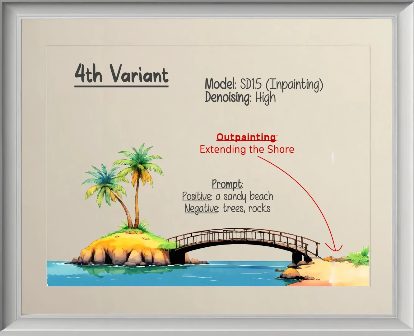
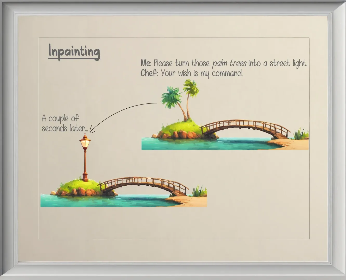
Variant four is where we introduce the biggest change since variant two. While the overall style is identical to variant three, behind the scenes I had to replace the chef for a moment. The reason: I wanted to extend the shore. At the time of writing, it pays off to work with chefs (models) that have been trained with a focus on inpainting for both inpainting and outpainting1. Sort of like a specialist. In plain English: if I wanted to keep the overall picture while modifying the palm tree or replacing it by something else entirely, I would choose the inpainting approach to do so. Here’s an example showing how our chef can easily turn a bunch of palm trees into a street light:
Inpainting
Questionable design decisions
description
What was I thinking?
In a nutshell: I simply had to select the palm trees and reiterate with a prompt asking for a street light instead. I could’ve fine-tuned the result a little more with an aim for a somewhat perfect blend, but this is simply a conceptual demo. So I guess we’re good. Similarly, if I wanted to extend the image to add more context, I’d resort to outpainting. Which is exactly what happened in variant four. The shore is now wider. However, as you can see, it is somewhat flawed.
Two things: first, there is a smudged line in variant four where the shore got extended. This is primarily the result of my attempt to experiment. In other words, prior to the example above, I never used InvokeAI to do this sort of work. So far, I’ve used different tools. Consequence: what you see ain’t spotless. Does it matter? Of course not! Because I already knew that’s not where our little island project is going to end. So instead of spending some extra-time on fixing variant four, I simply used it as the source for the next iteration. I know the chef. He’ll fix it.
Second, before moving on I want you to pay closer attention to the recipe (prompt). As you can see, we have a positive/negative structure and both of these prompts are kept incredibly short. Learning how to use different versions of Stable Diffusion will teach us a few things. For instance, a negative prompt often helps with SD1.5 to avoid unnecessary creative additions. In other words, the reason behind asking this particular chef to avoid rocks and trees is because those appeared in some of his creations I asked him to do. In that respect, the SDXL-chef is way easier to communicate with. I hardly ever use negative prompts when interacting with him. Of course, that also depends on our individual communication styles. So don’t assume you can blindly follow my approach. Remember, I’m a linguistic chef. I do have some refined experience to get the job done.
Fifth and Sixth Variant
Spot the difference
description
You might want to click to zoom...
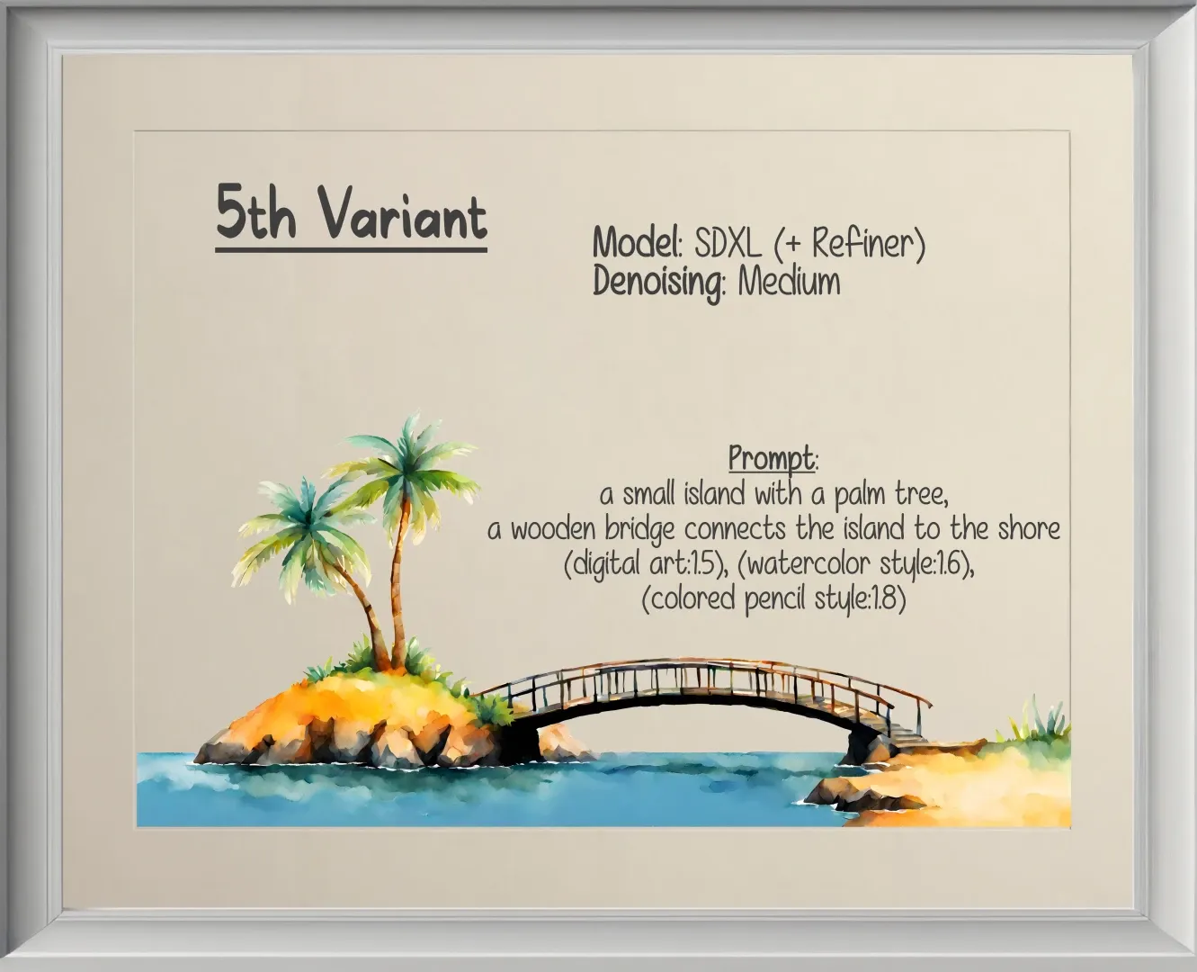
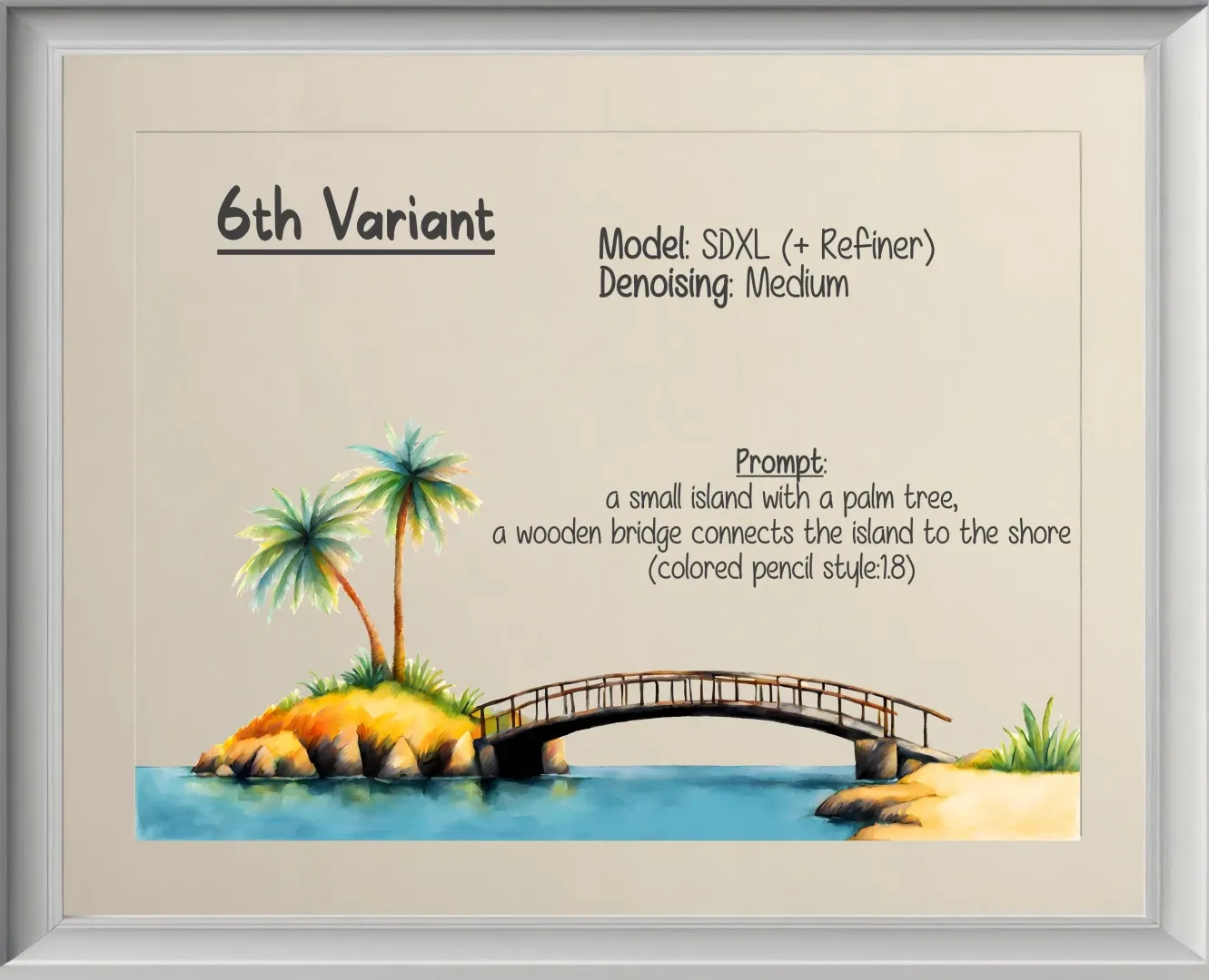
With variants five and six we continue business as usual. Between the two, variant six again has an emphasis on colored pencil style and this time you’ll see the texture is slowly going in that direction. Moreover, beginning with variant five, we now work with the sous-chef (Refiner) — explaining why the changes appear to be a little more pronounced even with a medium level of creativity.
Now, is this needed? Why not simply continue with the chef alone? He seems to be doing fine, after all. The answer to that question mostly depends on personal taste. And to help us decide, we best use a comparative approach. In other words, you take a source dish, give it to the chef and let him produce a visible result. Then, you take the chef’s result and hand it over to the sous-chef and let her do her magic. Finally, you look at both results and decide which one you consider more in line with your vision. Personally, I prefer a node-based approach like the one in ComfyUI (opens in a new tab) to build these comparative workflows. Incidentally, this feature has been added to InvokeAI some time ago. I just didn’t get around to playing with it yet. As I mentioned earlier, I like to keep an open mind regarding the tools I use to build my workflows.
Seventh Variant
Artifact
description
The grass is greener...
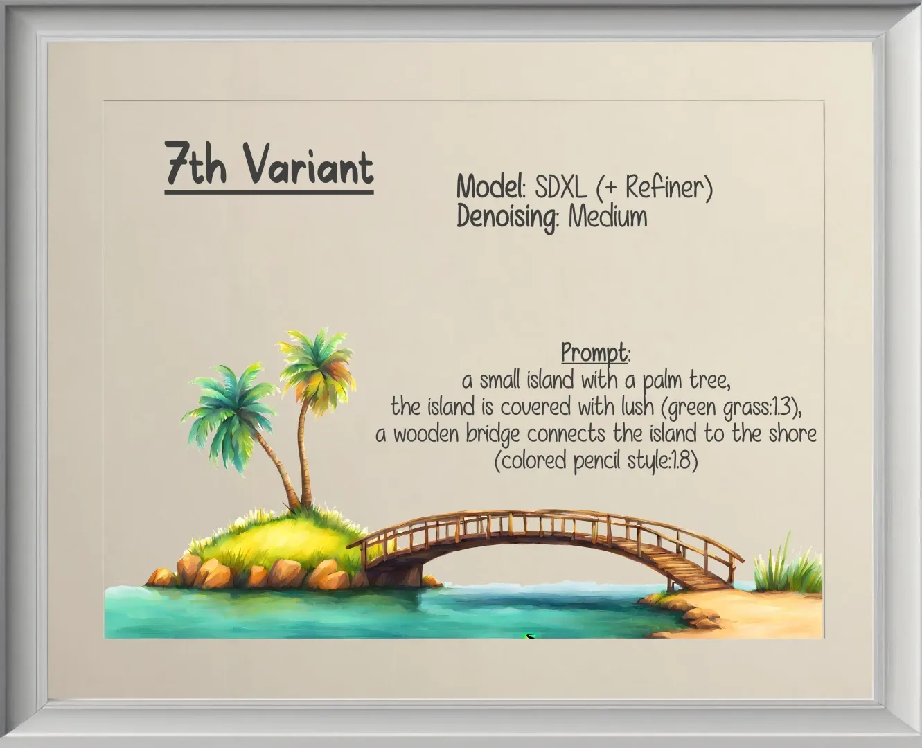
Moving on to variant seven. This is where I was getting ready to complete my vision. All good things must come to an end, after all. Compared to the previous one, the only major change is in the recipe. More specifically, I wanted for the island to be covered in lush green grass. And the chef i.e. the sous-chef delivered. One iteration on medium denoising was enough. Again, the more nuanced the source image, the easier to achieve the desired outcome. And by now, we’re a solid team of chefs. I provide a clear vision; they deliver the goods — leading up to variant eight.
Eighth Variant
Endless iterations
description
Time to call it a day.
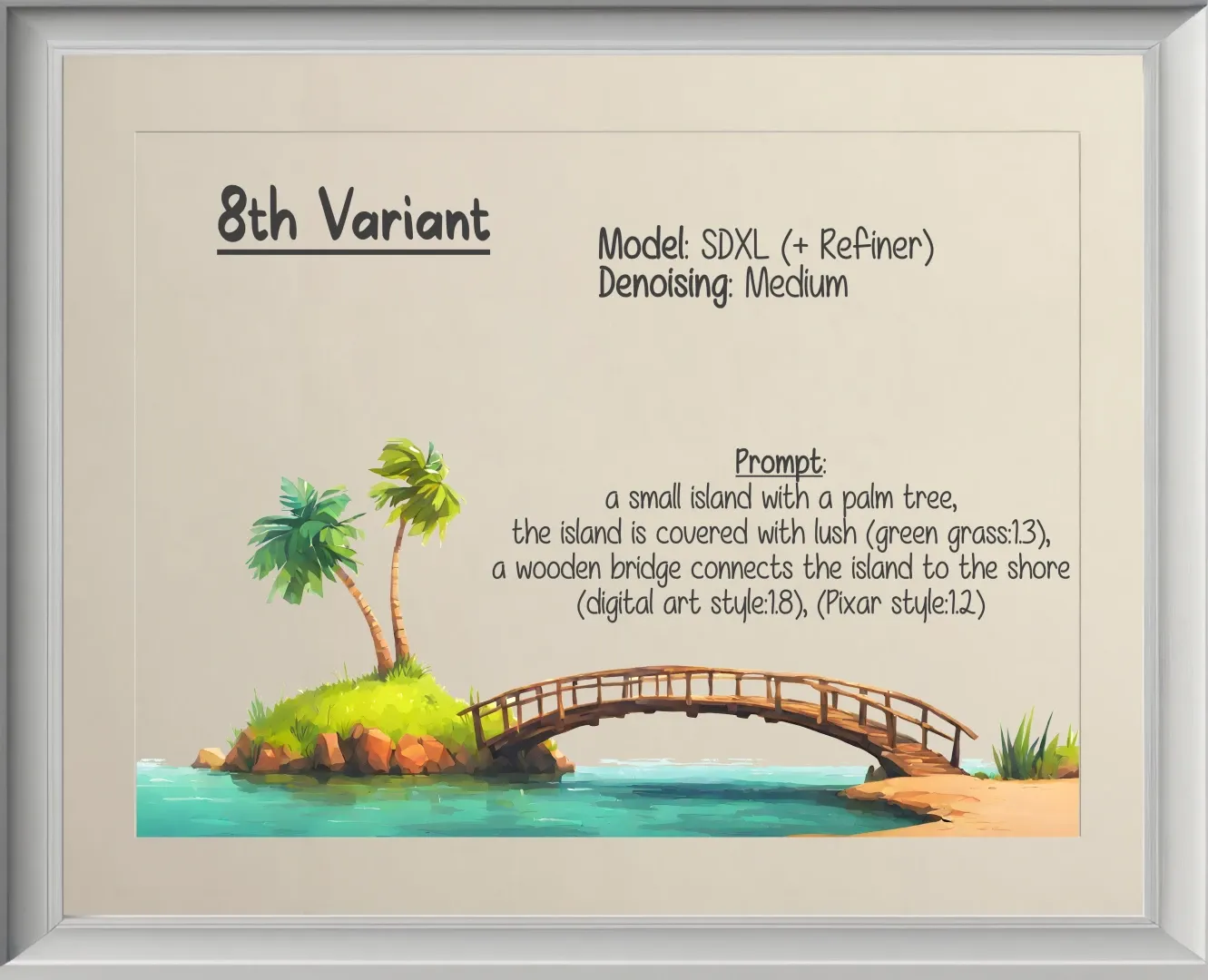
For the final iteration, which I already spoiled in the inpainting example, I just felt like exploring a different blend of herbs and spices. Combining digital art style with Pixar style and adding it to the pot containing variant seven, we obtain a result that simultaneously achieved my goal as well as wife approval status. But to be clear, the intention wasn’t to turn the image into a product straight out of a Pixar movie. Instead, that particular style was just like any other ingredient to help steer my illustration (or dish) into a particular aesthetic direction. Of course, this isn’t to tell you that I always know exactly which path I want to explore next. Often times, experimentation is required to decide between multiple paths. Well, to be honest, between an infinite number of different paths. And there’s a lot of creative thinking that can go into forging our own. We just have to start somewhere and take that proverbial leap of faith.
Dessert
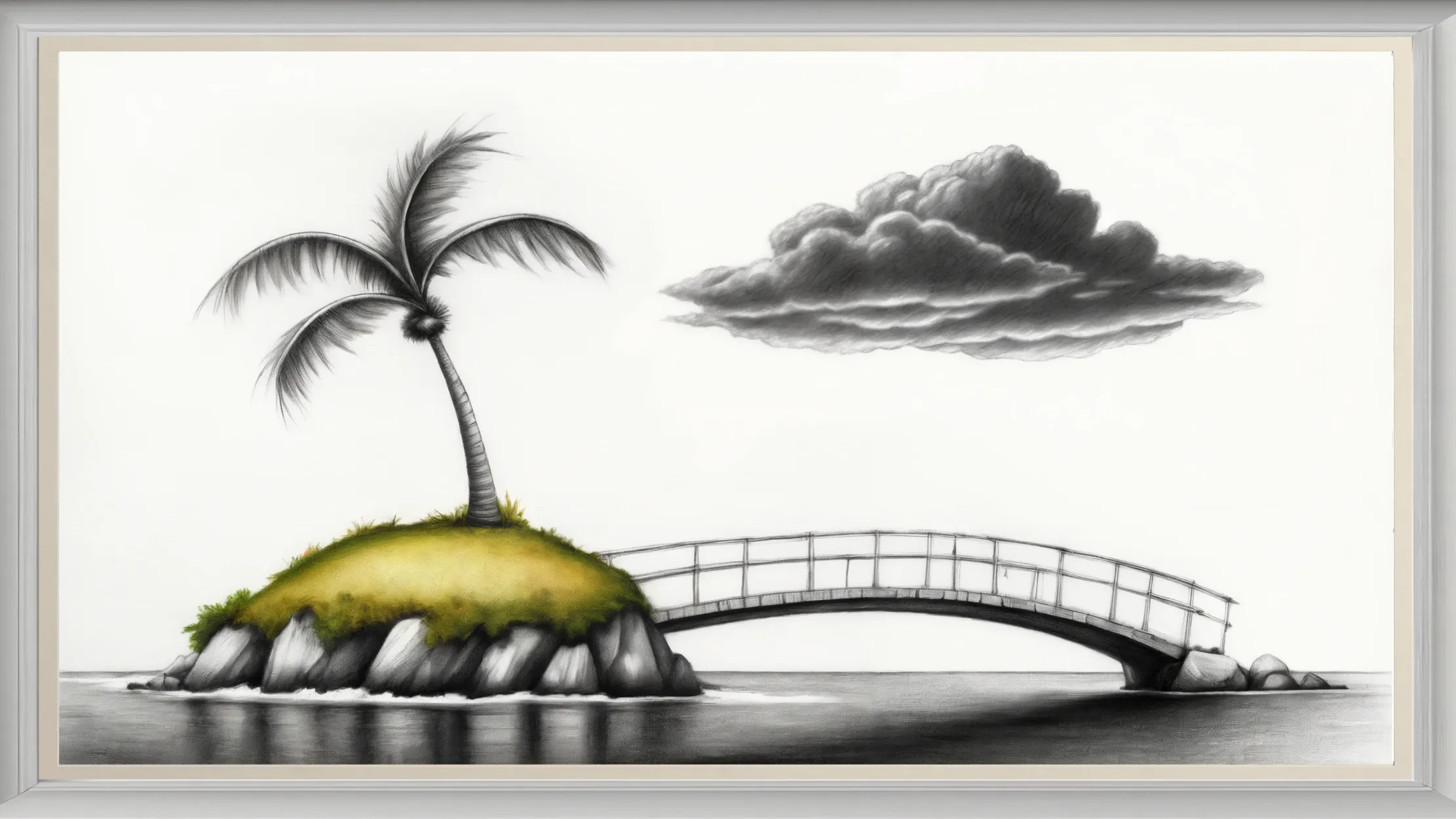
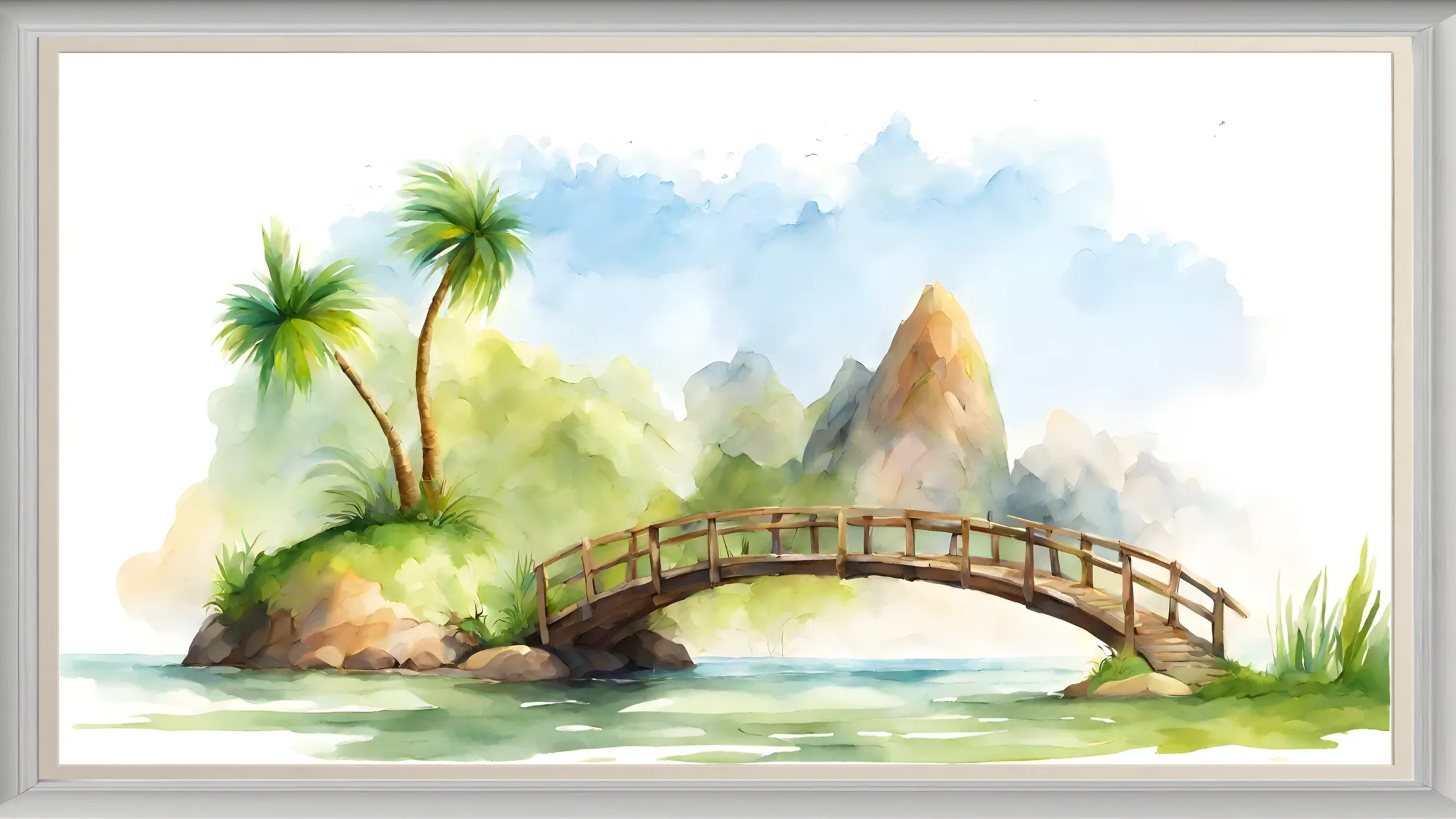
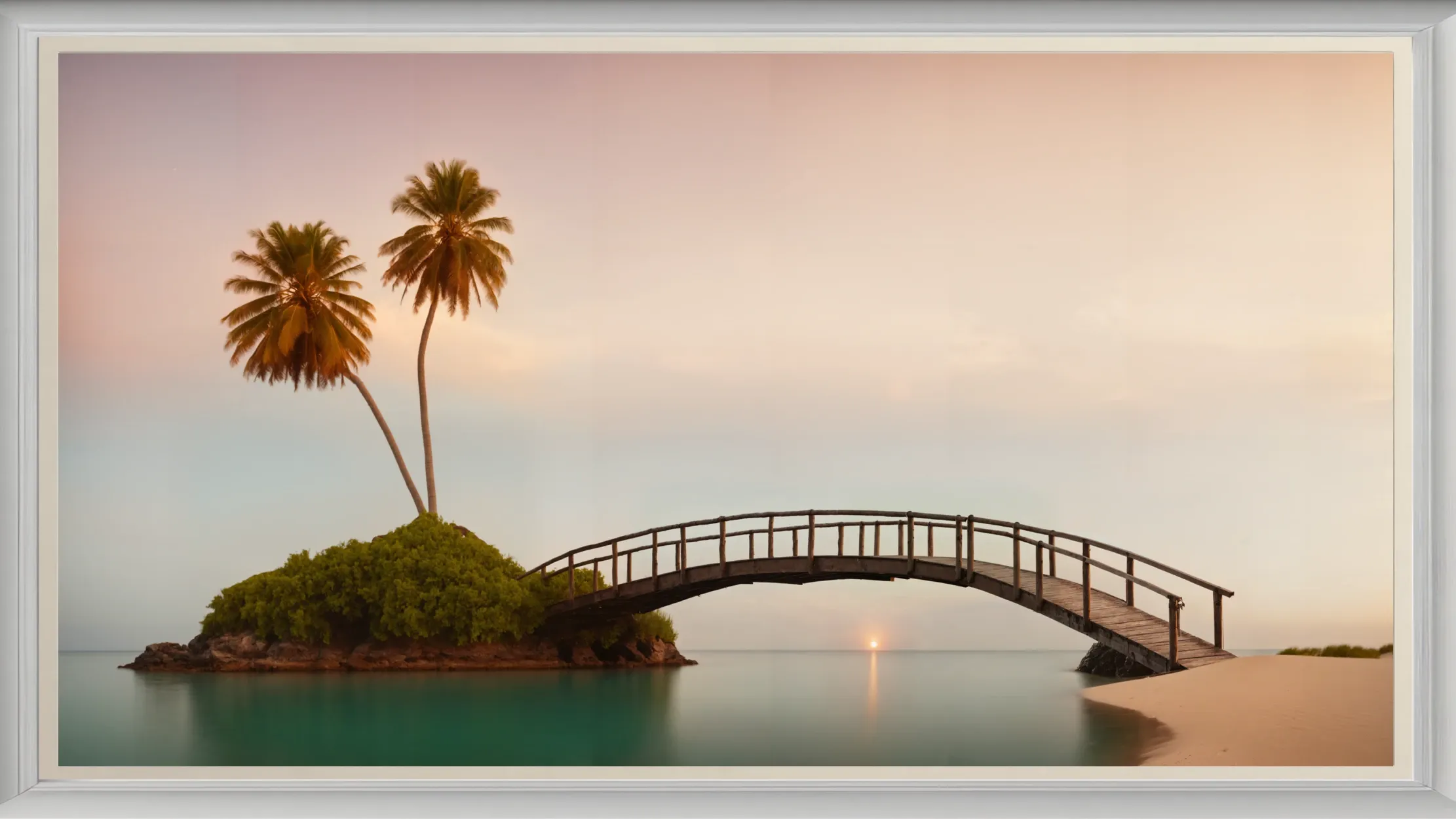
At this point, you should be able to deduce the recipes for the final three images on your own. They’re not particularly sophisticated. But should you have any difficulties, here’s a suggestion: just feed those creations to a multimodal A.I. and ask it to describe them for you. Long story short, I invite you to take a look at the remaining three islands (of note: I didn’t bother fixing the physical details as these examples aren’t meant to showcase real-life architecture, but a shift in style).
Stylistic Choices
description
The (still) early days with Stable Diffusion
According to further testing, a ControlNet for inpainting in combination with a regular (SDXL) model seems to work just as well. But to be honest, I wouldn’t even be surprised if there are already different techniques I’m simply not aware of. ↩︎
